🌍 The real context (nov de 2021 - dez de 2022)
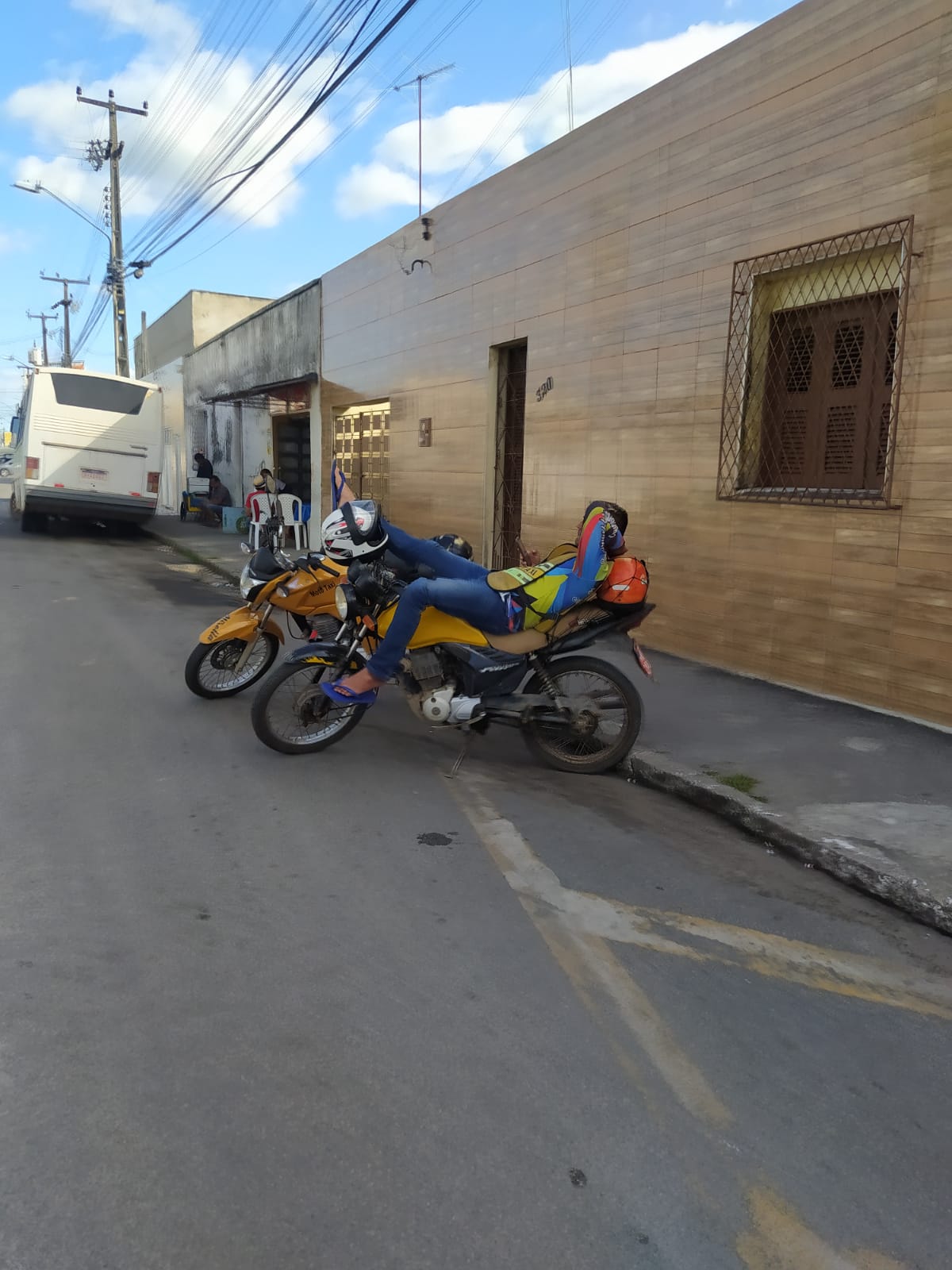
Amid the scorching heat and heavy traffic of Fortaleza's metropolitan region, we saw a gap in the urban mobility landscape. While big techs like Uber and 99 focused solely on the capital, smaller cities in the surrounding metro area remained underserved.
That’s where we spotted a real opportunity, not a shelved idea, but a latent need. SPEEDY MOTO was born from active listening, from the streets, from the real heat of the city.
This wasn’t a project based on assumptions. It was real, hands-on user-centered design. Every visual, functional, and strategic decision came from real life — not spreadsheets or guesswork.
👥 The team behind SPEEDY MOTO
Denis Araújo – Lead Product Designer
Led the product vision, information architecture, user flows, wireframes, and final UI. Also conducted field research and defined the strategic positioning of the solution.
Bruna Miranda – UX Designer
Worked on user journey mapping, usability validation, and prototype testing. Played a key role in connecting research insights to interface decisions.Pablo Ykaro – Full Stack Developer
Turned prototypes into a working product, ensuring performance, stability, and integration with external tools. Bridged the gap between design and technology.
We were paying attention. We knew every move the big techs were making — and more importantly, where they weren’t. On top of that, we realized something crucial: existing apps didn’t even prioritize the “motorbike” category — the most efficient option for that context.
We partnered with mechanics to offer discounts on parts and maintenance, reducing operating costs for drivers. We ran real tests in smaller cities in the metro area
Before hitting the streets, we started with a strategic approach: we built a CSD matrix (Certainties, Suppositions, Doubts) to map out our assumptions and guide the research direction. At the same time, we conducted thorough desk research to understand the national landscape of motorcycle taxi services.
One of the key findings came from an official source:
According to the Brazilian Municipal Profile Survey (2017) by IBGE, we found:
2,560 municipalities in Brazil had motorcycle taxi services — representing 46% of all cities in the country.
For comparison: 4,110 cities had regular taxi services at that time.
In the Northeast region, 1,385 municipalities offered mototáxi services — more than half of all cities with the service in the country.
These numbers confirmed what we sensed on the ground: there’s a vast, underserved market for motorcycle-based mobility, especially in smaller cities and non-capital regions.
We went to the field. We interviewed over 20 motorcycle taxi drivers and more than 100 passengers across smaller cities in the Fortaleza metropolitan area. We wanted to understand their daily routines, challenges, and motivations around local mobility.
This phase was led by Denis Araújo (Lead Product Designer) with support from Bruna Miranda (UX Designer).
Quantitative Researche
Number of participants: 131
94.7% - have used the motorcycle taxi service in the city.
40% - use it 2 to 5 times a week.
46.6% - go to the motorcycle taxi when needed.
45.8% - call the motorcycle taxi when needed.
80.2% - have had difficulty finding a motorcycle taxi.
75.6% - find it harder to locate a motorcycle taxi at night.
53.4% - feel unsafe when they do not know the pilot.


We translated our field learnings into real personas and user journey maps. We uncovered friction points such as:
Lack of digital tools
Communication and location challenges
Low trust in the service
Financial management needs for drivers
This formed the foundation of the product strategy.
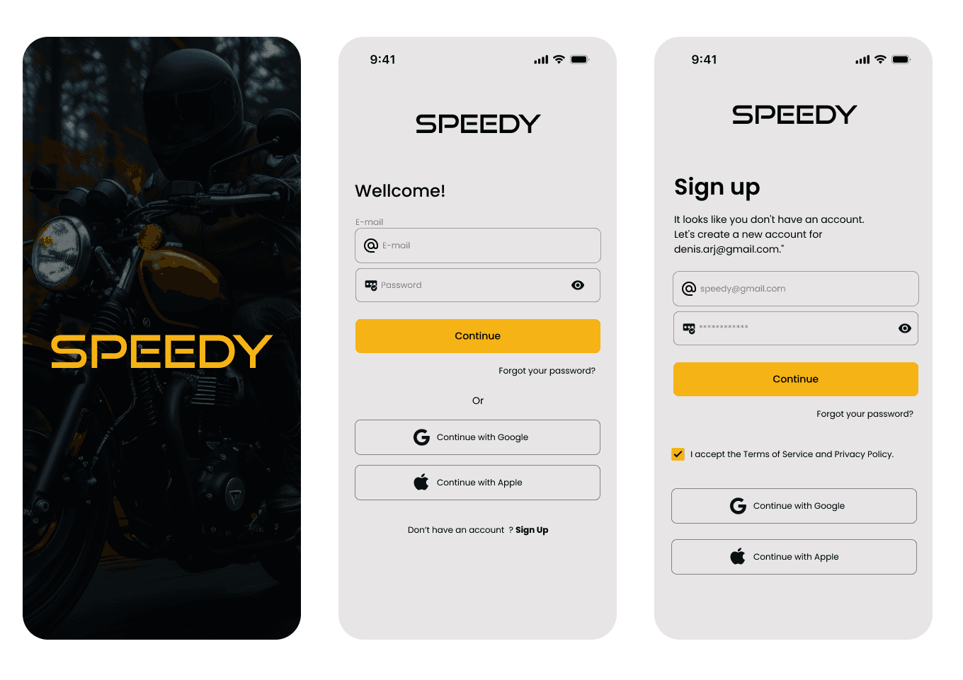
Based on the journeys, we designed low-fidelity Figma prototypes and tested with users from the very first screens.
The focus was: clarity, speed, and simplicity — even on basic phones and weak connections.


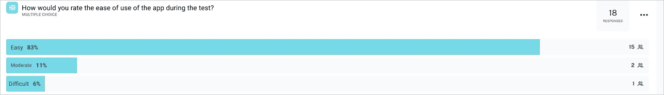
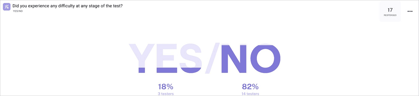
The initial tests were conducted using the Maze tool and qualitative methods. The results for the first prototype were positive, but we identified several opportunities for improvement:
Visual Hierarchy: Needed adjustments to ensure clear and intuitive navigation.
Interaction Points: Some interactions required refinement.
Accessibility: Certain screens did not meet color and contrast guidelines for visual accessibility.
We made the necessary adjustments and conducted further testing with users. This time, we observed an improvement in usability.